
Wishmaker – Online Casino Brand Design
Wishmaker is online casino like no other. Fun, unique, and trustworthy, they know what players want and need. Designed and created to offer a thrilling experience in a stylish and responsible manner, their large selection of casino games, great promotions and VIP rewards make Wishmaker the winner.
We worked with Wishmaker to design a unique brand identity that really sets them apart and conveys their message. We started with a logo design, logo guideline, and proceeded with the design of a unique mascot. While working together we also delivered multiple motion and illustration projects.




Logotype Guidelines
We designed the Wishmaker logo to properly represent the company’s values. It conveys a sense of welcoming, freedom from corporate stuffiness, and trust. Wishmaker wanted a logo that does the talking by itself, so we designed a modified logotype that is clean, modern, and memorable.
With that we prepared a Logo Guideline which outlines all the rules that apply when using the logo. It serves to aid empoyees when preparing any promo and company materials, as well as clients and press when featuring the logo in any way. This helps ensure that anyone who uses the logo preserves the company vision and doesn’t represent them different than intended.
Color Palette
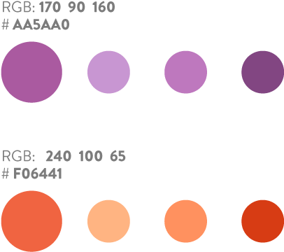
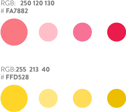
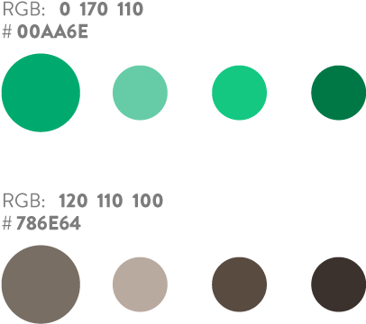
A large part of Wishmaker’s brand identity is defined by its colors. As they vary depending on the type of media and color system used, the brand book we prepared for Wishmaker includes both RGB, CMYK, and HEX values of all their brand colors.
There are 3 primary colors associated with the company, and several secondary colors, which can be used for the purposes of illustrations, banners, etc. Different light values are also defined.
Primary Colors
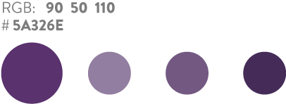
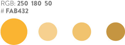
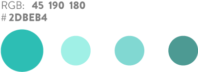
Secondary Colors
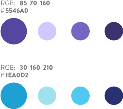
Icons
To suit Wishmaker’s casino needs, we designed several icon packs in three different sets – colored, negative, and positive. This allowed their use in various contexts.
Alternative Logo Design Concepts
Using same style, color, weight and size makes Wishmaker icon set cohesive. The icons have to deliver the right message so they must be used consistently for what they were originally designed for.
“We have been working with Strong Gaming for a long time now and have achieved quite a lot. The work on our latest projects was no different. We were presented with multiple proposals and solutions when it came down to creating brand elements, logos and other designs. They were also very responsive in terms of changes, revisions and updates regarding every task needed. Everything was delivered on time. We have numerous upcoming projects down the line and we are going to continue using Strong Gaming’s services.”
Mick
