

Case Study – Affiliate Casino Website Logo Design
Concept

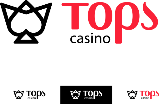
The redesigned logo represents a heart that is tangled with the shape of the letter “T”, standing for the name of the casino website. The heart is a symbol of few meanings. In the design process we emphasized on the shape of the heart as a deck symbol and underlined its secondary meaning as a romantic symbol by using the red color.


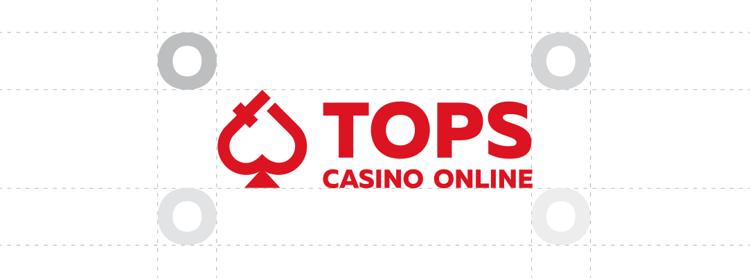
Logo Guidelines
Leading gaming affiliate website branding starts with gaming logo redesign. We went from keeping the core symbol from the original logo – a heart. Our approach could be defined as a modern flat design. The main goal we set was to design a logo that would be simple and distinguished from the industry’s common conventions.
We had the primary vision that the new logo must be multi-layered in terms of meaning and relevance with the industry it is intended to. The red color itself has it’s own meaning in the world of gaming as well. It is the color of passion in singular context, however, in gaming context it could be read as the color of the play.
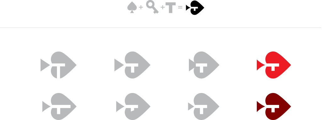
Shape Exploration
Logo Composition
Logo Composition
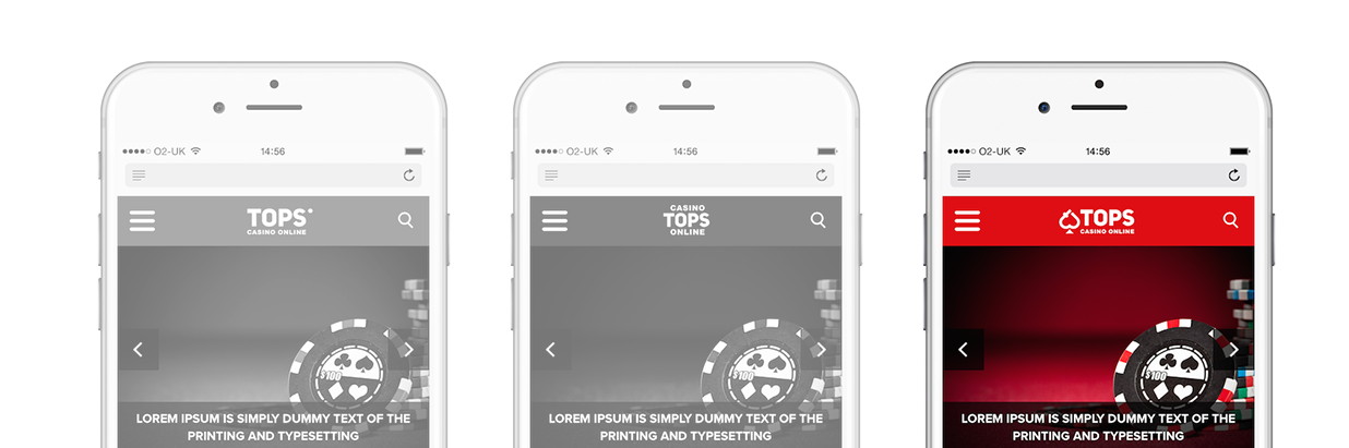
The way a logo would look like on different types of media is of big importance. That’s why each step of the design process was guided by our well developed sense for composition. One of the key characteristics of the logo is its compatibility thus allowing the use of the logo on different medias, since it defines certain aspects of space surrounding the sign. The wording is composed in two lines in order to recreate a rectangular shape.
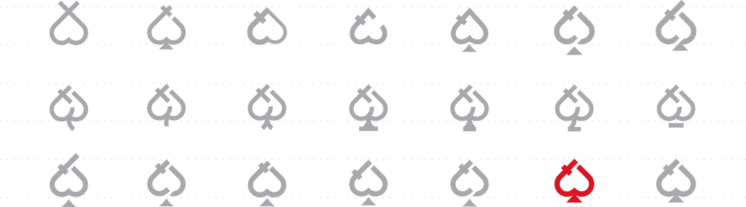
Pattern Exploration
Gaming Design Pattern 2
Gaming Design Pattern 3
Gaming Design Pattern 4
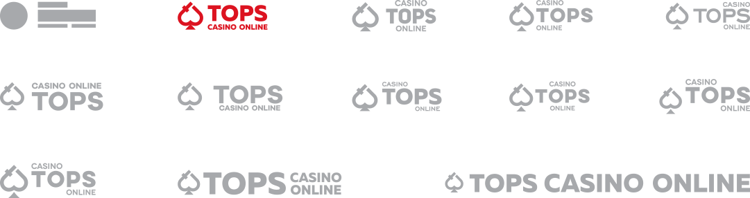
Alternative Logo Design Concepts
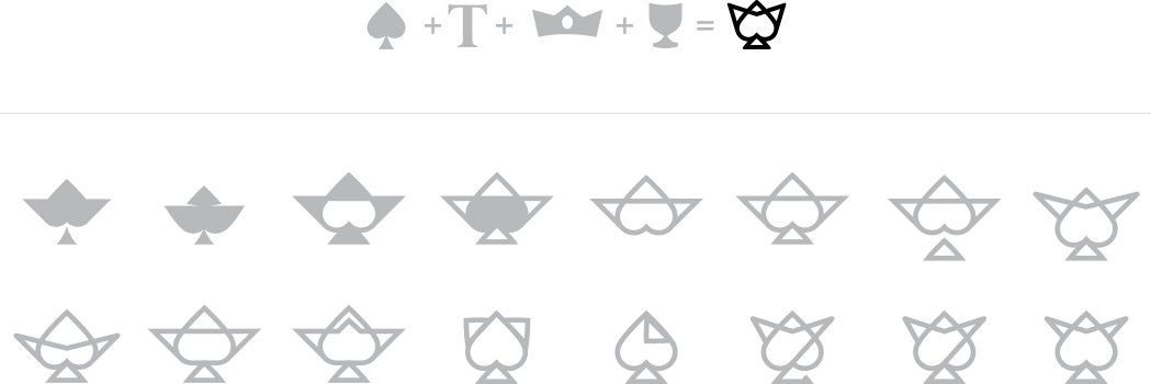
A mix between heart, crown, T letter and goblet is what describes this alternative logo best. The purpose of using several symbols, combined in a sign is related with the game of associations the human mind likes to play. That makes the sign memorable and likeable.
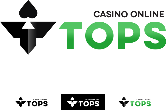
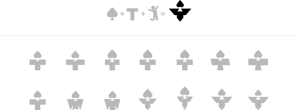
The composition in this alternative logo showcases a different approach. The letter “T” and the heart symbol together create a human silhouette. It is more simple but yet meaningful design.
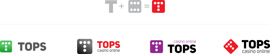
We named this alternative “A new classic”. The classic five dots of a dice’s side are rearranged in new T-shape, referring to the name of the website. It’s original and memorable, because of the untraditional use of already known concept.
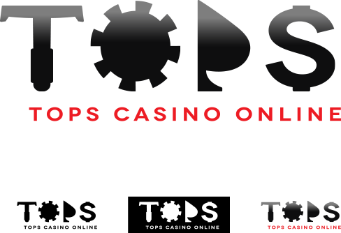

“TOPS” here is presented with large style letters that have stand-alone meaning as well. The “T” looks like a poker chip stick, the “O” is a poker chip itself, the “P” is presented with the half of a heart, while the “S” resembles a dollar sign.
The symbol of the “key” is introducing the idea for “unlocking the potential” in this alternative. The logo looks compact and elegant featuring this symbol together with the heart and the “T”.
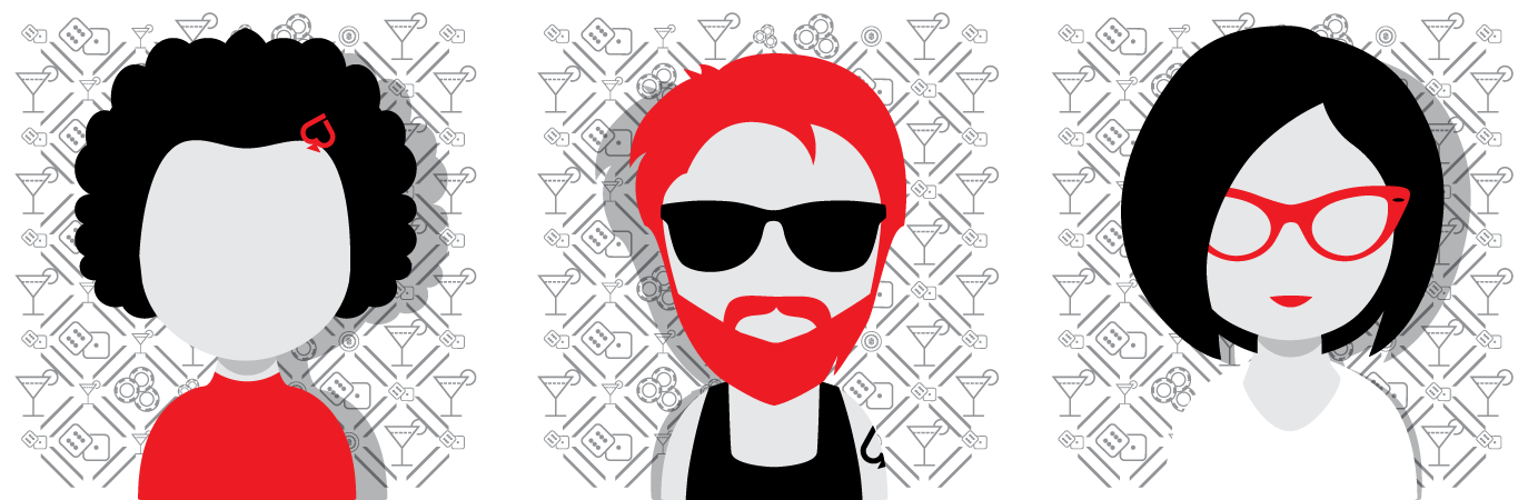
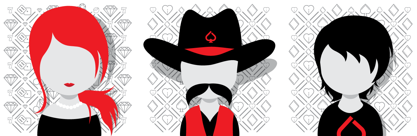
Icon Design Set
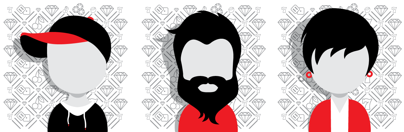
Avatars to match the logo?

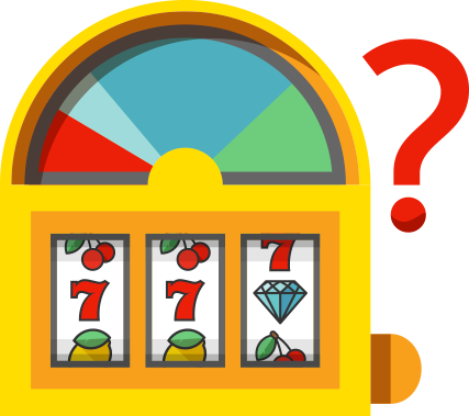
What are
the odds
of winning
while playing your
favorite game?
Graphics
We have many more flat designs and cool elements to show off regarding Casino Tops’ branding. Stay tuned!
We know that creating a good looking newsletter combined with a working one is a difficult task. That is why we decided to work with Strong Gaming. They followed our guidelines when creating the designs while adding a colorful touch where needed. The developers worked hard to make sure the newsletter looks great across multiple mail clients – both web and desktop. The support also included mobile devices optimization. Strong Gaming met our deadline with no problem and we were able to deliver a finished product to our players.
Miroslava & Mihail