


Case Study – Affiliate Casino Website Logo Design
Concept

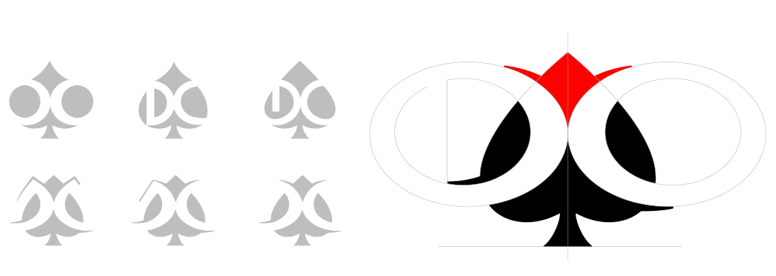
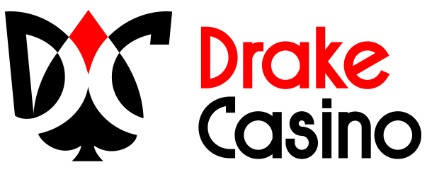
The concept of the logo connects the sign of the spade with the letters D and C, standing for Drake Casino. The shape of the sign resembles a classic spade figure, while the letters could be read on a second level. The symbol of the crown is standing between the letters and the spade’s top. It’s a detail we used in order to achieve associations with royalness, victory, winning.
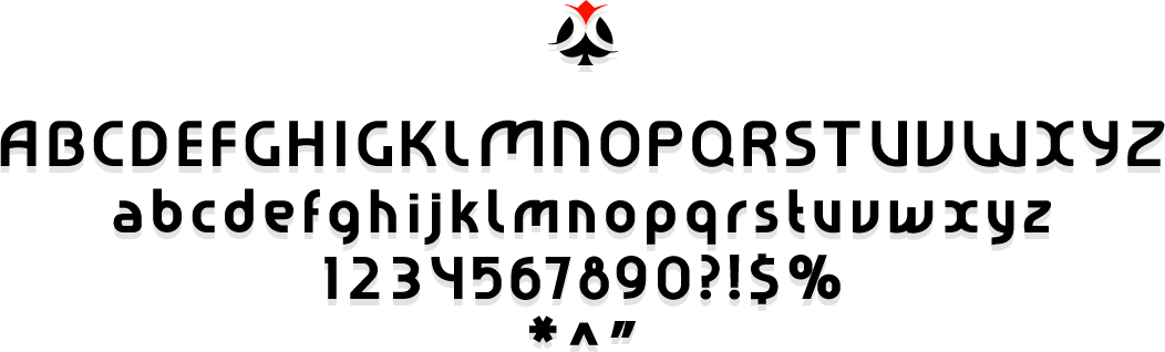
Custom Logotype Font
The logotype font features geometric and simple shapes with no serifs. The letters are build with vertical and horizontal lines and arcs. What’s written with the font looks stable and serious, and yet with a sense of friendliness.
The main idea was to use readable and original font. That’s why we researched the internet, collected data from various casino websites, analyzed carefully what we had and then made our final decision.
Shape Exploration
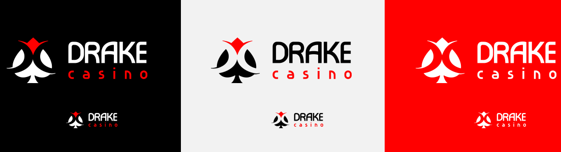
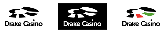
Logo Composition
Logo Composition
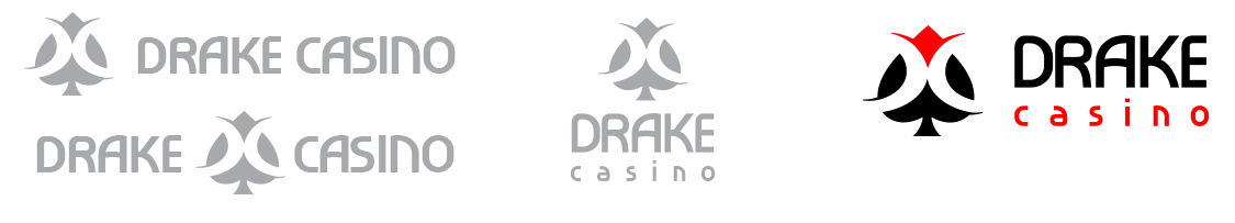
We considered a few possible compositions for the logo, but at the end our experience led us to select the most compact one. Drake casino is written in two lines, standing next to the graphic sign. What we wanted to achieve is maximum readability and aesthetics.
Pattern Exploration
Alternative Logo Design Concepts
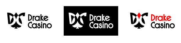
One of the alternative logos we had under our sleeve was very similar to the final one, with small difference in the design. For example, the D and C were more expressed in the alternative, and the sign for royalness were more abstract and less literal.


In this case Drake Casino is written in two lines and features a graphic symbol only as a small detail. This logotype is simple and straightforward. Its minimalistic shape serves to the purpose of the brand in a similar way with the logo of the client.
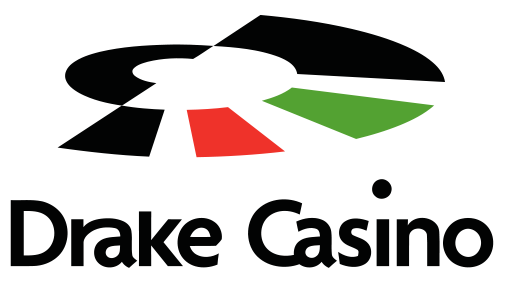
Thoroughly different from the other proposals, this one features a roulette wheel. The letters D and C together lock at the center of the wheel with their appropriate shapes. The colors we used could be recognized on every roulette wheel. That’s the way a player will get in game mode only by looking at the logo.


The dice as a symbol has a strong connection with the casino industry. We did our take on it and came up with this alternative logo featuring the d and c letters as a dice dots. “Drake Casino” written in two lines stands next to the dice. Its composition is similar to the selected logo due to its compatibility.
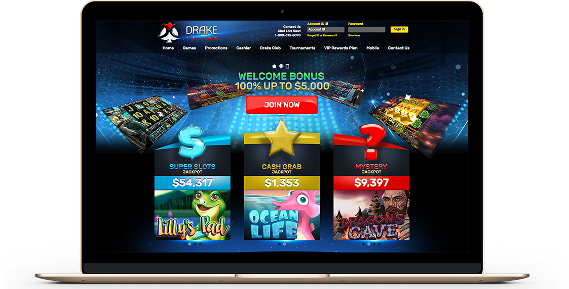
Having already completed several projects with Strong Gaming, we were in need of a redesign for a few websites. Since Strong Gaming created the original websites, we trusted them to do it again. While we still wanted a new look we had to stick to the structure and identity that was already recognizable enough and in place. The finished product was exactly what we needed – a modern looking website that represented what the website really is about. Strong Gaming are following the design trends all the time and we are confident that they will do this again on the redesign of our next project.
John